Wednesday, September 19, 2007

New Work

I just finished a logo for Jupiterimages' newly minted "green committee," dedicated to greenifying the corporation from the inside-out. Here's the logo for the Pasadena office.


********************************
IN OTHER NEWS: I'm leaving the company. I got recruited by Warner Brothers' promotion/advertising department to join their design team. I'm really excited about this, because 1) it's a cool place to work, 2) it's a little more money, and 3) I love entertainment design, but I've never been able to get my foot in that door. So it really floored me when I got a phone call from the VP for marketing/advertising saying that she found my portfolio on creative hotlist and that she wanted me to come in to meet her team. When I came in, she greeted me in her toy-and-poster-cluttered office wearing a vintage rolling stones shirt, and I just knew it was the place for me. I start on October first.

Friday, June 22, 2007

HOW Conference in ATL just happened to rule.

HOW's design conference this year was held in Atlanta, GA--the land of Lil' Jon and Peaches. I must say it was the best design conference I've ever been to. More accurately, it was the first design conference I've ever been to. But none the less, I had been excited about it for days and it lived up to my expectations for sure. I left inspired at the end of it all, and now I feel like such a better designer from associating with some of the best people of the industry. Here are some of the highlights:

Steff Geissbuhler was awesome.
Chillin with Steff Geissbuhler
Corporate ID is my first love, and this cat has some of the most recognizable logos to his credit; the NBC peacock, Barneys New York, and the Time-Warner "eye-ear" mark to mention a few. He had a lot of good things to say about the client/designer collaboration part of making a successful logo, but the main thing he wanted us to all know is the importance of really, truely listening to the client. I also loved how he considers a logo to be something organic; it must evolve and grow. He brought this up toward the end of his shpeal on the design process when creating a logo for a big corporation, because once we're done with the our part we have to hand the logo off to the company's in-house design department and it's out of our hands from then on. It's like having a kid, then watching it go off to college. Lord knows we don't all turn out the way our parents want us to!

This guy named Armin Vit from some studio somewhere.
Chillin with Armin Vit
Armin gave a fantastic presentation detailing the pain and the pleasure gleamed from his career thus far. While there were many, many presenters at this conference, Armin's stood out particularly because of his casual style of presenting; he didn't take himself so seriously and he urged us all to do the same, with speach outline headings like, "You're not that good," and "75% of your files are trash." It felt more like a conversation than a lecture, and I left with the confidence that comes with knowing ALL of us have to slave over the design to be able to get lucky sometimes. Also dispencing similare wisdom was the man named Chip Kidd who I did not get a picture with, however I did get to joke around with him at the big conference wrap party at the Georgia Aquarium.

More than a funny last name, it's Grip's Kevin McConkey!
Chillin' with Kevin McConkey
The Grip principal shared with us his methodology for making burnout delicious. His big deal was how we need to manage client's expectations and keep our priorities straight. With this knowledge I'm sure I will never feel the pain of burn out. Ever. :)

The Type Director's Club exhibit
cool typography
Of all the cool sideshow exhibits to see, they had the most interesting work on display. The typography in this show was amazing.


There was a ton of other great things going on at the HOW conference, but there were too many things to mention here, besides, I'm trying to keep my entries BRIEF for chrissakes. Basically, I want you to know that if you weren't there, you totally missed out and should go eat a half-gallon of sorbet to console yourself. I suggest peach, it's what they eat in Georgia.

Tuesday, June 19, 2007

Another good one.

Here's another ad you'll love.
Great typography, but another stupid message. Click the image to see the original:


Tagline (I'm serious):
"PS2. Because your girlfriend bores you shitless."


Now, there are many reasons why this message is bullsh*t. Here are two:
1) Girls like playstation as well. I know plenty of gamer grrls who can frag the crap out of you.
2) This assumes that a) you're not gay, even though you'd rather to spend your whole day with your hand on a stick and b) that you actually have a girlfriend, which is just not believable if you're a real, hardcore gamer dude. And besides that, everyone who's had one will tell you that every hour wasted with your playstation is another hour spent not having sex with your girlfriend. Marinate on that.

-mdgg

Monday, June 18, 2007

C'mon, don't be that guy.

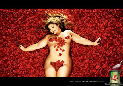
I was taking a walk through the good work posted on Ads of the World and I came across this campaign by studio Salles Chemistri of Sao Paulo, Brazil. They were advertising a new brand of low-fat yogurt. Now, I'm sure this idea sounded funny in the boardroom and the message might resonate with the consumer public at large, but personally, I just think it's weak. There are so many good directions you can go to advertise a healthy product, and I just think they dropped the ball here and went for the easiest way out.


In the interest of full disclosure, I like 'big' women. I'm not exactly a "Chaser," but I love the look of a healthy, curvy, rubenesque woman. So while this ad featuring a beautiful latina in a nude rose pedal scene a la "american beauty" is meant to inspire disgust, I reacted just the opposite. Hell, I think she's hot.

The guys from Salles Chemistri should have taken a page out of the Dove book and helped redefine the traditional unhealthy norm of skinny chicks being the hallmark of beauty. I mean, shoot. I think these models are the sexiest ones we've seen in print in a very, very long time.

Wednesday, March 7, 2007

I'll keep this brief.

I've created this blog to discuss (briefly) happenings in the graphic design industry that perk my ears up. This is a special-interest blog, geared toward creatives like myself who gets excited by great typography, offended with bad kerning, and have ever snickered when a client said, "Can you make it bigger?"